This post is a continuation of Acumatica Dashboard Tips and Tricks (Part 1).
Tip #4 – Use Shared Filters
Let’s continue to use the Aged Receivables based on Due Date example from the last post.
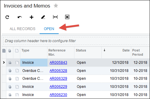
Since I added the Aging Bucket column to the existing Generic Inquiry that’s attached to the Invoices and Memos (AR301000) screen, we need a way to filter on only the Invoices and Memos that have a Status of Open.
When adding a Dashboard Widget, you can apply an on-the-fly filter. But the problem with an on-the-fly filter is that you often need to add multiple Widgets based on the same filter. And it’s clunky to have to manually add the same filter every time. Then if you want to change the filter later, you have to remember to change it for every Widget.
It would be nice to put the filter in one place, then simply reference it on every Dashboard Widget that you add.
Well, you can. Just add a Shared Filter to the Generic Inquiry.
Click the Filter icon, put the filter in place, then click SAVE, give it a name like “Open”, then check the Shared checkbox and click SAVE again.
")
Now you have a Shared Filter which is displayed as a button above the Generic Inquiry:
When you add a new Widget to a Dashboard, the Shared Filter is available:
")
Lastly, one thing I don’t like about Shared Filters is that they can really clutter the area above the Generic Inquiry. It would be nice if users could decide which ones they want to display and in which order. If you also think that would be nice, cast your vote here:
Vote to improve Shared Filters in Acumatica (click here)
Tip #5 – Choose an Appropriate Visual
Use a Scorecard KPI widget if it’s just one number that you want to display.
Use a Trend Card KPI widget if you want to display a number, but also see how it’s trending over last month, last year, etc.
Use a Data Table widget if you just want to see the rows and columns like you would in a Generic Inquiry. Just note that they don’t yet support scrolling. Click here to cast your vote to add scrolling to the Data Table Widget in Acumatica.
Don’t ever use a Chart -> Doughnut widget. Just like Pie Charts, they are useless.
Use a Chart -> Line widget if you want to display a number trending over time where time is on the horizontal axis.
Use a Chart -> Column widget if you want to display something in time buckets like Years, Quarters, etc.
Use a Chart -> Stacked Column widget if you want to display something in time buckets like Years, Quarters, etc. but you also want to see categories within those buckets (like salespersons, product categories, etc.).
Use a Chart -> Bar widget if you want to display something in buckets that are not time related. Your brain wants to see time as a horizontal axis. Bar Charts move down a vertical axis which tells your brain that this is not a date/time category.
Use a Chart -> Stacked Bar widget if you want to display something in buckets that are not time related, but you also want to see categories within those buckets.
Use a Chart -> Funnel widget for CRM Opportunity data to show the various stages in the pipeline. I’m not sure if there are other places where this widget works well.
Tip #6 – One Dashboard per Department or Audience
Don’t create tons and tons of Dashboards.
You can add as many Widgets as you want to a Dashboard and the user can just continue scrolling down to see them.
I like to create one Dashboard per Department. Or at least per Audience, meaning a group of people. Maybe within the Purchasing department you have a Dashboard for Buyers, then a separate Dashboard for the Manager because they are two different audiences.
Tip #7 – Infinite Scrolling
Kind of related to the previous tip. Don’t forget that you can easily scroll down in a Dashboard to see more Widgets. This is known as infinite scrolling.
Think of often you scroll on websites, whether it’s on a phone or on a computer. Many news websites have figured out that the infinite scroll is a great way to drip information to you. Same with Facebook, Twitter, LinkedIn, etc.
Scrolling is better than clicking.
Create less Dashboards with more Widgets that can be access via scrolling rather than having to click around through multiple Dashboards.
On this point, you’ll find that when you are adding new Widgets to Dashboards, oftentimes you want to add the same Widget as you added previously, but with a slight variation. Wouldn’t it be nice to copy and paste them? If you agree, click here to vote on the ability to Copy and Paste Dashboard Widgets in Acumatica.
Conclusion
Have any comments on the above tips and tricks?
Got your own tips and tricks?
Head over to the Acumatica Dashboards forum (click here) in AUG, an Acumatica User Group, and post your thoughts.